
Reading for next week
Chapter 18; pp 227-254; pp 265-271; pp 273-276
Bootstrap videos
Design Principles
Web Design Tips
Advanced CSS
 |
 |
 |
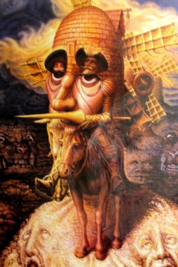
*Don Quixote, fully titled The Ingenious Gentleman Don Quixote of La Mancha, is a Spanish novel by Miguel de Cervantes Saavedra. Published in two volumes, in 1605 and 1615, Don Quixote is considered one of the most influential works of literature from the Spanish Golden Age and the entire Spanish literary canon. As a founding work of modern Western literature and one of the earliest canonical novels, it regularly appears high on lists of the greatest works of fiction ever published, such as the Bokklubben World Library collection that cites Don Quixote as authors' choice for the "best literary work ever written"
Gestalt Psychology was founded by Max Wertheimer
Gestalt psychology is based on the observation that we often experience things that are not a part of our simple sensations
Over the years, other authors have adapted Gestalt Psychology to form the Gestalt Theory on Web Design
The central idea behind Gestalt is when we see a group of objects we perceive their entirety before seeing the individual objects
We see the whole as more than the sum of the parts
The following are Gestalt Web Design Principles
For more, visit smashingmagazine.com
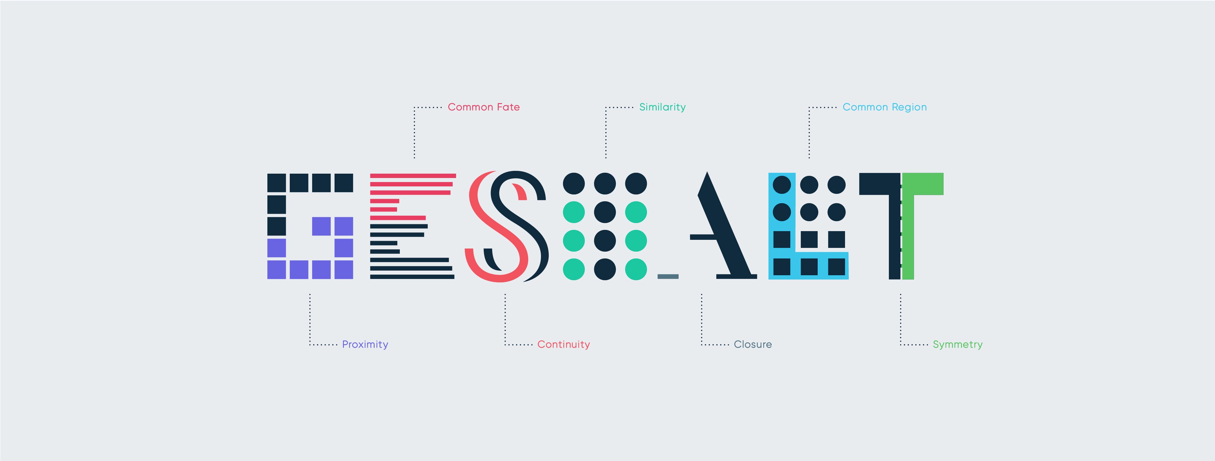
Some key ideas behind the Gestalt Theory:
Emergence (the whole is identified before the parts)
Reification (our mind fills in the gaps)
Multistability (the mind seeks to avoid uncertainty)
Invariance (we’re good at recognizing similarities and differences)
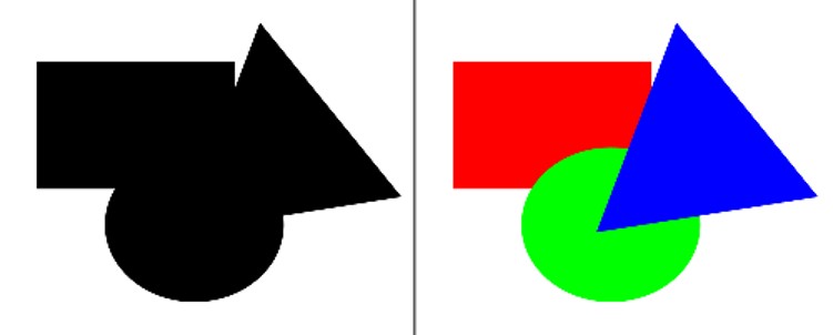
LAW OF PRÄGNANZ (GOOD FIGURE, LAW OF SIMPLICITY)
We prefer to see things that are simple, clear, and ordered
You’re more likely to see the next image composed of the simple circle, square and triangle like you see on the right than as the complex and ambiguous shape the whole forms
In this case, seeing three distinct objects is simpler than seeing one complex object
LAW OF PRÄGNANZ (GOOD FIGURE, LAW OF SIMPLICITY)
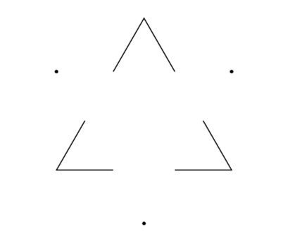
In the left part of the next image, you are able to see a white triangle, even if the sides are not there
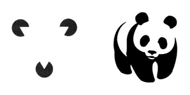
In the right part of the image below, you are able to see the panda, even if the panda is a set of several random shapes
This deals with our tendency to link individual elements to form a pattern
The key to closure is providing enough information so the eye can fill in the rest. If too much is missing, the elements will be seen as separate parts instead of a whole. If too much information is provided, there’s no need for closure to occur
In the image below, you should see three pairs of curly brackets, even though there is more space between the curly brackets than there is between each pair
Since our eyes will quickly find symmetry and order, these principles can be used to effectively communicate information quickly

In the next image, do you see the vase or the face? If you perceive the black as a background, you see the face. If you perceive the white as the background, you see the vase. This creates an unstable relationship between the colors. The more stable the relationship, the better we can lead our audience to focus on what we want them to see
Figure/ground refers to the relationship between positive elements and negative space. The idea is that the eye will separate whole figures from their background in order to understand what’s being seen. It’s one of the first things people will do when looking at any composition


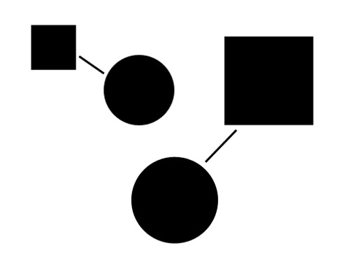
In the next image, the lines appear to connect the two pairs of elements. This connection leads us to perceive there is a relationship between the elements (even if one does not exist). Take note that the lines do not need to touch for the connection to be perceived
Of all the principles suggesting objects are related, uniform connectedness is the strongest. In the image, even though we see two squares and two circles, we see the square–circle pairs as more strongly related because they are visually connected
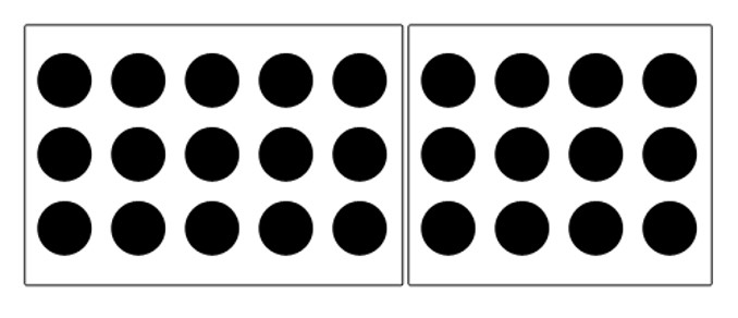
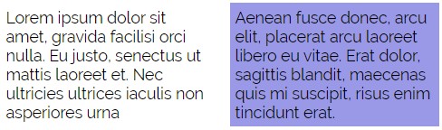
Another way to show a connection between elements is to enclose them in some way. Everything inside the enclosure is seen as related. Everything outside the enclose is seen as separate. The circles in the image below are all the same, yet we see two distinct groups, with the circles in each enclosure related in some way
Some ways to accomplish this task is to:
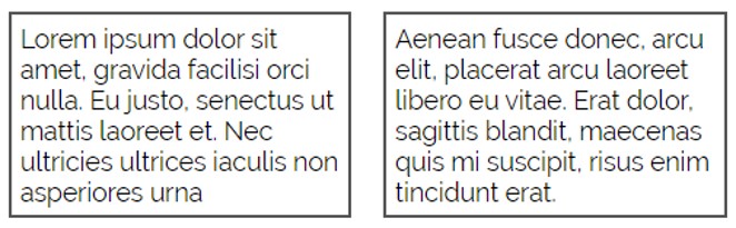
Draw a box around like elements
Placing like elements on different backgrounds
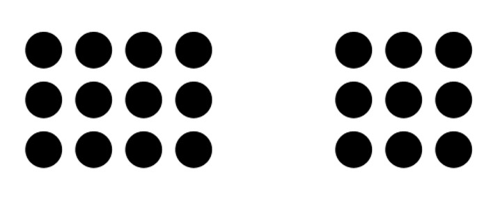
Similar to COMMON REGION, we can group elements together utilizing empty space to create the relationship
This is especially true when the elements in the group are closer to each other than they are to any elements outside the group
The objects don’t need to be similar in any other way beyond being grouped near each other in space in order to be seen as having a proximity relationship
It’s instinct to follow a river, a path or a fence line. Once you look or move in a particular direction, you continue to look or move in that direction until you see something significant or you determine there’s nothing significant to see
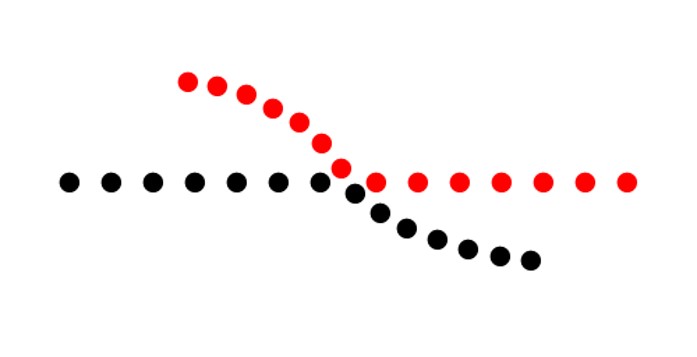
Another interpretation of this principle is that we’ll continue our perception of shapes beyond their ending points. In the next image, we see a line and curve crossing instead of four distinct line and curve segments that meet at a single point
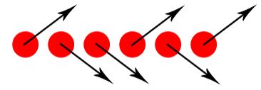
Regardless of how far apart the elements are placed or how dissimilar they appear, if they are seen as moving or changing together, they’ll be perceived as being related
In the next image, the arrows are enough to indicate the elements share a common fate. While movement or change isn’t necessary, both are still a stronger indication of common fate than things like arrows or looking in the same direction which only imply movement
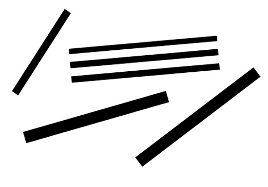
Elements that are parallel to each other are seen as more related than elements not parallel to each other
In the next image, the lines that are in parallel are perceived to be more related than the three lines not in parallel
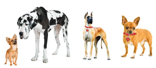
Elements that share similar characteristics are perceived as more related than elements that don’t share those characteristics
In the next image, red circles are seen as related to the other red circles and black circles to black circles due to the similarity in color. Red and black circles are seen as dissimilar to each other even though they’re all circles

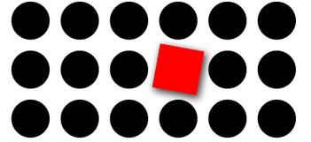
Elements with a point of interest, emphasis or difference will capture and hold the viewer’s attention
In the next image, your eye should be drawn to the square. It’s a different shape and color from the other elements. There is also a drop shadow to further emphasize it


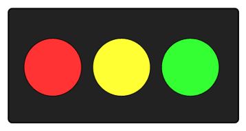
Elements tend to be perceived according to an observer’s past experience
Having seen traffic lights throughout our lives, we expect red to mean stop and green to mean go. You probably see the next image as a traffic light on its side, because of the three common colors. That’s past experience at work
Many of our common experiences also tend to be cultural. Color again provides examples. In some countries, white is seen as pure and innocent and black as evil and death. In other countries, these interpretations are reversed
It is critical that you listen for what your customer desires
Try to avoid making assumptions
However, do not oversaturate your customer with questions
It is important that you guide the user through the web page. You can do this by utilizing:
Position - Where something is on a page clearly influences in what order the user sees it
Color - Using bold and subtle colors is a simple way to tell your user where to look
Contrast - Being different makes things stand out, while being the same makes them secondary
It is important that you guide the user through the web page. You can do this by utilizing:
Size - Big takes precedence over little (unless everything is big, in which case little might stand out thanks to Contrast)
Design Elements - If there is a gigantic arrow pointing at something, guess where the user will look
Utilize size and color to highlight areas of importance and areas that you want your user to view/act
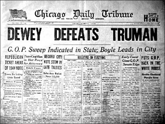
In newspaper, the top story is always printed above the fold of the newspaper, this way the newspaper can attract people to buy the newspaper to read the top story
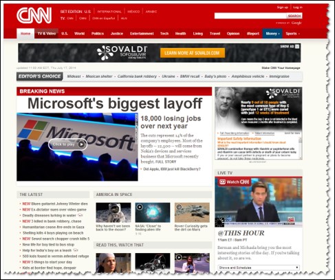
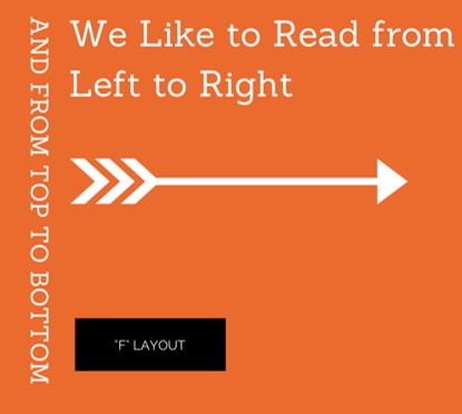
Most important items need to appear in the top left portion of your site
1. Do you see a vase or two faces?
A. vase
B. faces
C. both
D. neither
2. What is an organized whole that is perceived to be more than the sum of its parts?
A. Gestalt
B. Wertheimer
C. Gerhardt
D. Gesticulate
3. What is Emergence?
A. our minds fill in gaps
B. the mind seeks to avoid uncertainty
C. we're good at recognizing similarities and differences
D. the whole is identified before the parts
4. What is this an example of?
A. Figure/ground
B. Closure
C. Continuity
D. Common region
5. What is this an example of?
A. Figure/ground
B. Closure
C. Continuation
D. Common region
6. What is this an example of?
A. Focal Point
B. Similarity
C. Parallelism
D. Common region
7. (true/false) One essential skill for a developer is effective use of design elements, positioning, color, contrast, and size to guide the user's eye through a page
A. True
B. False
8. Where should the most important elements be placed on a page?
A. center
B. upper right
C. upper left
D. it doesn't matter
9. Can we safely assume what colors a client would like us to use?
A. Yes
B. No
10. What principle might this be?

A. Focal Point
B. Symmetry
C. Parallelism
D. Common region